A Look at Donor Recognition at SickKids

During our trip to Toronto for the first annual Association of Donor Relations Professionals Canadian Regional Workshop, we visited the new Peter Gilgan Centre for Research and Learning at SickKids. It is an architectural beauty, and showcases many of the newest trends in donor recognition. First we noted the handsome lettering that so nicely identifies the building and highlights the contemporary branding characteristic of SickKids. Upon closer inspection, we were delighted to find major donors honored on the blue glass panels to the left of the entry.

Donor Recognition Display, Sickkids, Toronto, ON
This element of surprise continues with the donor recognition inside the facility. Donor names are presented on colored glass panels that double as a signature feature in the atrium. Names are neatly presented in vinyl, allowing for easy updating. Typography is consistent throughout the building and coordinates well with the architecture and the brand. Donor names occur tastefully as a part of the wayfinding and room signage.
Donor recognition display, Hospital for Sick Children, Toronto, ON

Donor recognition detail, Hospital for Sick Children, Toronto, ON
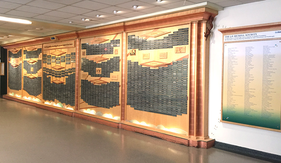
We also toured the public areas of the main hospital. The older portion of the Hospital for Sick Children was built in the 1950s and has grown over time. The primary donor recognition spaces are large and nicely positioned near the newer atrium entrance. These displays include recognition going back several decades. The components have been added to over time and maintain the original design, which is not closely tied to the current branding. There are fun elements, such as the children’s drawings and carved squirrels.

The alignment of donor recognition, old and new, with an institution’s brand guidelines is tricky business. Branding changes even more frequently than architectural styles while most donor recognition products are considered permanent. Heurista frequently recommends a very subtle, enduring design for the framing of donor recognition components with elements such as large format print graphics, inserts and digital media that can change and evolve with the institution’s brand and messaging. Given the nice large format posters on display in the original lobby of the SickKids hospital, the forward-looking, recognizable style of the SickKids brand could be introduced into the primary donor recognition hallway.

Large format posters in original lobby of Sickkids hospital
POST WRITTEN BY ANNE MANNER-MCLARTY · NOVEMBER 2015