Lowcountry Food Bank
In 2018, Heurista began talking with the Lowcountry Food Bank assuming that we’d be focused on donor and sponsor recognition. A tour of the Charleston, South Carolina facility led to the request for a full recommendations report to identify opportunities for philanthropic placemaking. That report had one overarching theme: make the facility itself an experience of Lowcountry Food Bank brand for the thousands of volunteers, sponsors, donors, and staff who work in the space in the course of a year.
The recommendations were well received, but as often happens, our friends in the Lowcountry were quiet for a good long while. When they were ready to act, however, they came back big! Instead of choosing one or two of the projects we’d recommended, they selected five areas to improve – the lobby, development hallway, Chef Carter BackPack Buddies Room, the newly named Smith Volunteer Break Room, and the adjacent area in the warehouse. As the work unfolded, a donor recognition display, the Staff Break Room, and Community Conference Room were added to the project list. Installations in those spaces were completed in late 2020. The brand enhancements, Including new colors, the fruit and vegetable pattern and the pallet wall were so well received, they’ve since been integrated into all Lowcountry Food Bank communications.
Outcomes
-
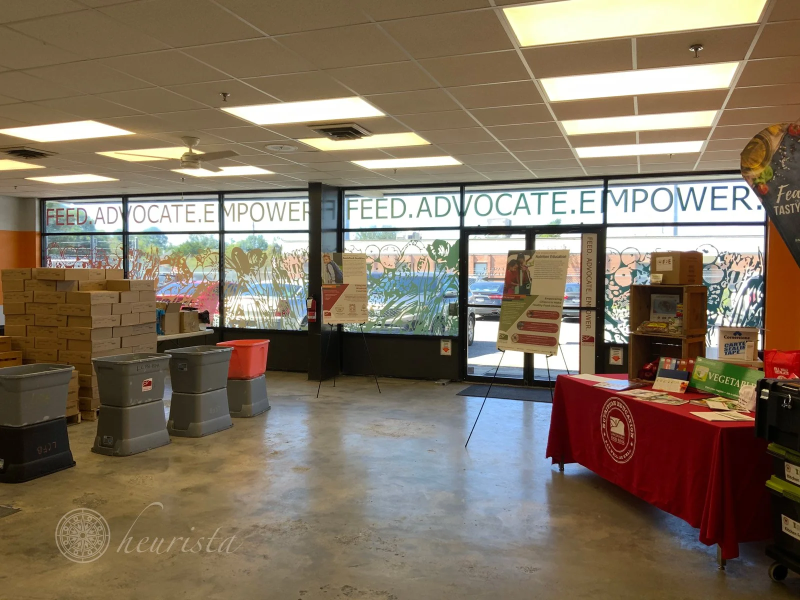
Philanthropic placemaking is a way of approaching storytelling and environmental graphics that reflects the values of the community that uses the space. At Lowcountry Food Bank, large format print, sculptural application of reclaimed wood, and dynamic recognition displays serve to bring vitality to the physical space where staff and volunteers work to feed those in need.
-
When Heurista’s work with the Lowcountry Food Bank began, there were brand guidelines and a well-recognized logo in place. Following the discovery period, Heurista enhanced that brand with a new set of colors, a fruit and vegetable motif, a style for infographics and ways to use two- and three-dimensional representations of pallet wood to symbolize the network of contributors to the work of feeding those in need. These brand elements can now be seen in all Lowcountry Food Bank communications. Check it out on their website: lowcountryfoodbank.org.
-
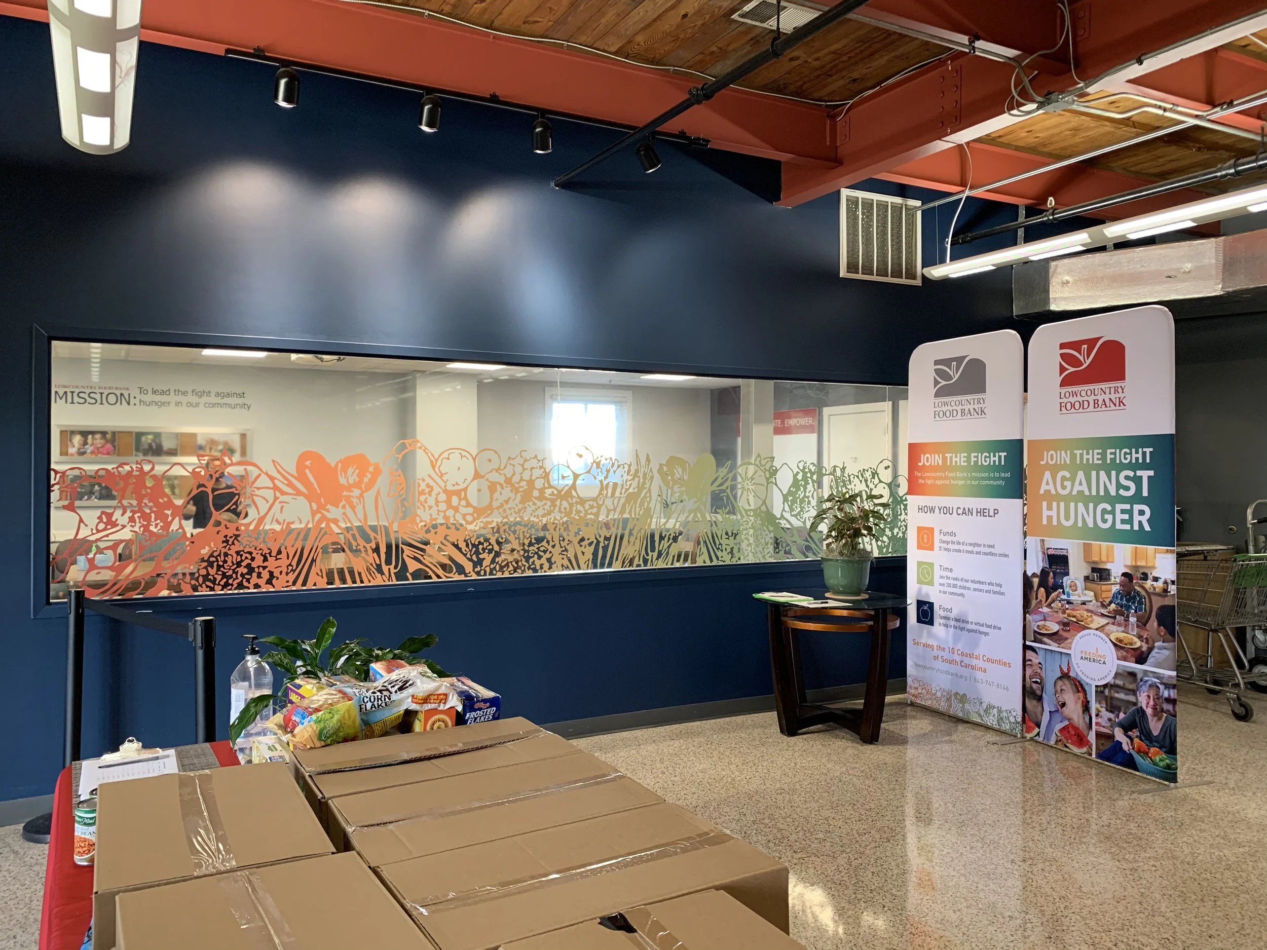
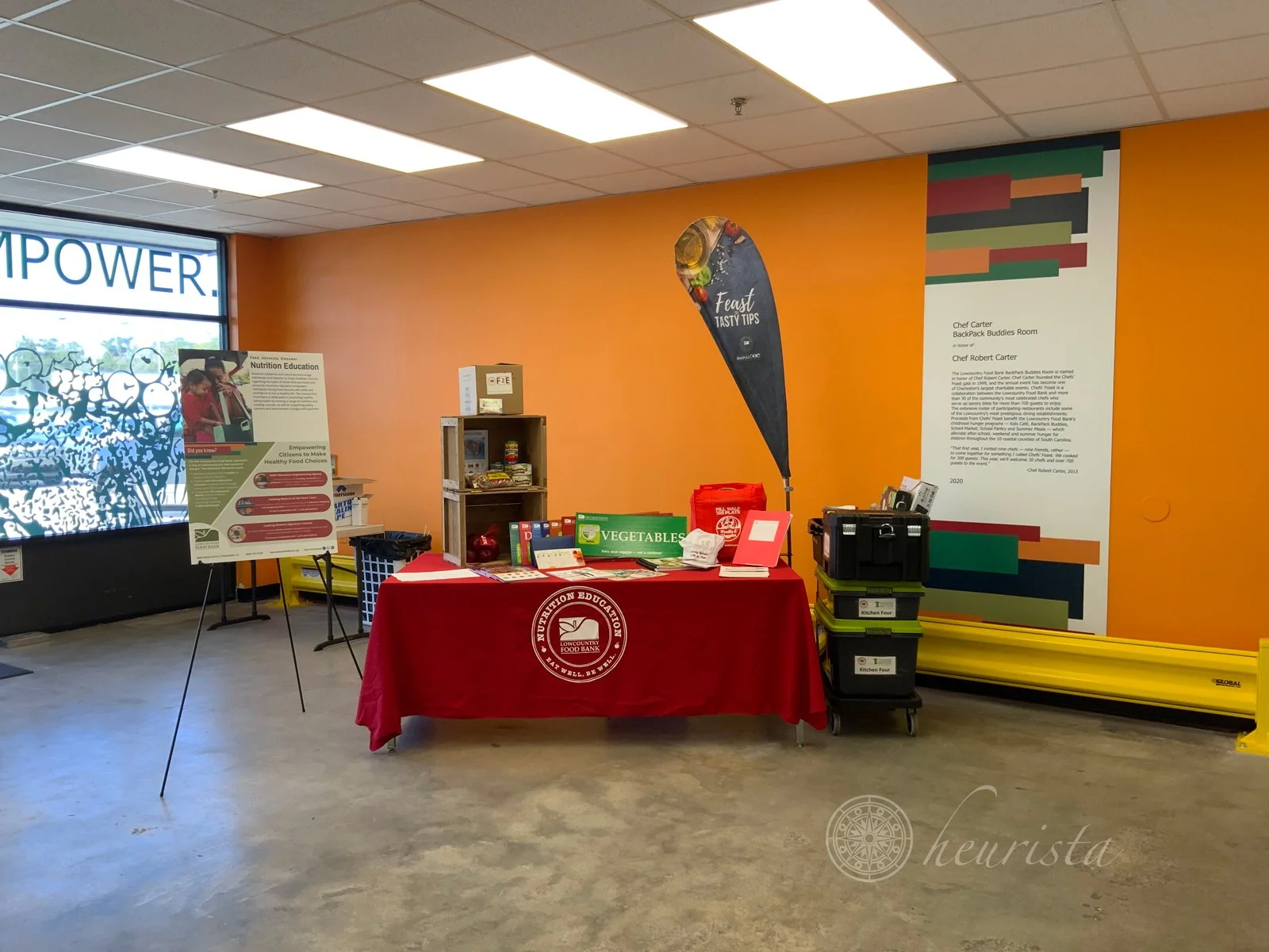
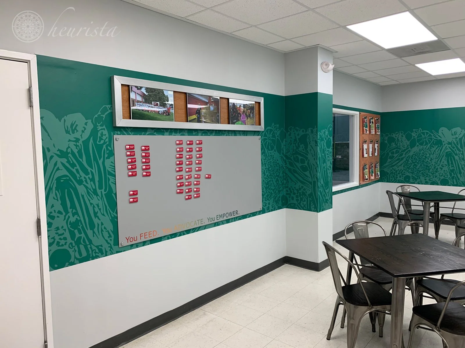
Given that this work took place during the time of Covid-19 restrictions, the client asked that we focus first on volunteers as a way of recognizing their commitment to coming to the warehouse to work for others in need. The first room we renovated was the Backpack Buddies room, where volunteers sort and pack food for delivery. The walls were painted the signature orange, the windows were treated with the new signature graphic, and a large scale infographic was used to remind everyone of the impact of their work across the 10 coastal counties served by the Lowcountry Food Bank. Later in the project, the volunteer break room was also enhanced with new paint, graphics, and easily changeable graphics to keep volunteers informed and acknowledged for their critical work in the food bank’s work.
-
With the recognition of volunteers underway, we turned next to staff recognition. The breakroom was enhanced with new paint, displays and a number of messaging boards to keep employees up-to-date on the impact of their work and the successes accomplished through team effort with the donors, sponsors, volunteers and dedicated staff members.
-
Sponsor support is a key component in how food banks gather the food, volunteers, and momentum to serve the community. The list of sponsors changes over time, so a prominent yet flexible system for featuring their logos was installed in the warehouse where it would be seen by staff, volunteers and the many trucks making deliveries.
-
Prior to the philanthropic placemaking effort, the Lowcountry Food Bank was doing more than many similar organizations to recognize their donors, although the products chosen were not very distinctive. The plaques and dimensional letters seemed foreign in the warehouse environment and were often overlooked.
By adding more storytelling and using larger graphics featuring the new brand enhancements, Heurista introduced new, more dynamic ways for naming areas within the warehouse. The recognition signage now brings focus to philanthropy and showcases the donors’ contribution to the work of the Lowcountry Food Bank.
-
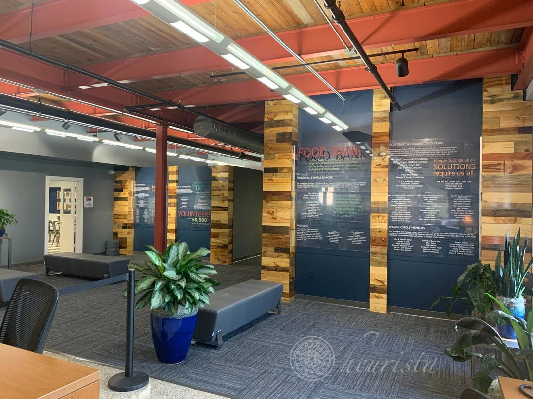
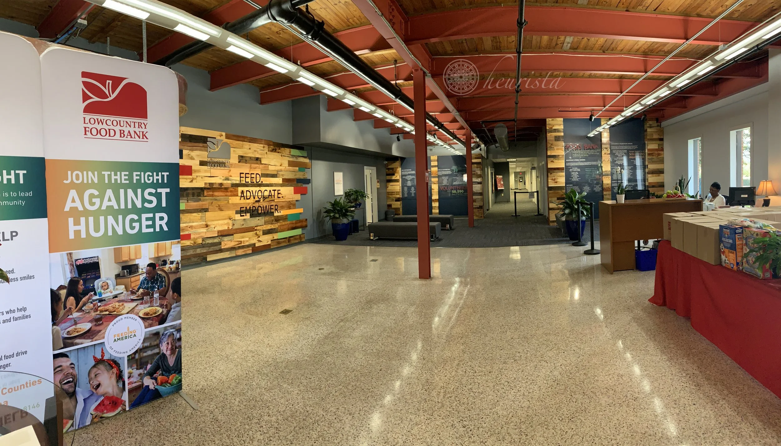
Our final accomplishment was a full revamp of the main lobby, including the replacement of the existing donor recognition display with a large, flexible display designed to showcase a wider variety of philanthropic contributions to the Lowcountry Foodbank. The walls were repainted with the brand colors, the pallet-wood feature wall was added showcasing the logo and mission statement, and the displays – covering two walls floor to ceiling – were installed, ready to greet every visitor to the warehouse. The lists and infographics on the displays are updated annually by in-house staff in partnership with a local print partner.

